

The Color Yellow is Inspiring!
Simply, wellness means health and happiness. Wellness for your home is simply about designing a healthy and happy home.
Your home is a place to nourish your soul. Wellness is also about harmony and balance. To achieve harmony and balance, begin with small steps. Small steps can make a huge difference. Adding color to your home is one small step.
Color is a very powerful design tool and adding pops of color to your home can have a big impact.
In the Homes for Health report from Harvard T.H. Chan School of Public Health, it states that “the average person spends 65 percent of their entire life inside their home.” And the United States Environmental Protection Agency (EPA) states that “Americans, on average, spend approximately 90 percent of their time indoors.” That’s an incredible amount of time spent indoors.
Your home is a place of health and wellness. So why not take creative control and create a space that is your own happy and healthy oasis?
Happy Space
Go from drab to fab. Add yellow to your home and life. Create a welcoming space.
Here are 5 reasons why you need to add more yellow to your home and life.
1.
HELLO SUNSHINE! IT’S SIMPE ~ YELLOW IS A HAPPY COLOR
It’s cheerful and sparks joy. Research shows that warm colors such as yellow, orange and red have a greater effect on our attention, as opposed to cool colors such as gray and brown. Yellow is a spirited color that evokes optimism and it’s the color of the sun.

Yellow is a happy color!
2.
YELLOW IS PART OF PANTONE’S COLOR PALETTE ~ YELLOW CAN BE BOLD OR SUBTLE
Depending on the hue, the color yellow can energize a space or create a calm, cozy, comfortable and warm space. Take a cue from the design experts. Pantone is a global authority on color. Pantone’s 2020 NYFW trends includes a shade of yellow called Sunlight (PANTONE 13-0822). To me, Pantone’s color Sunlight looks like a decadent creamy buttery yellow with a warm hue which is inviting and evokes joy. Go ahead—splash into yellow—design your living space with pops-of-yellow. There are many ways to bring healthy design into your home, so why not choose a color that brightens up a space and brings a subtle burst of energy, cheer and happiness?
A simple way to promote wellness in your home is to liven up a space with color by using paint with zero-VOCs.
Clare Paint @clarepaint offers Zero VOCs (Volatile Organic Compounds) paint in stunning colors. Other Zero VOCs paints can be found at BEHR. GREENGUARD Gold Certified such as BEHR MARQUEE interior paints is low VOC. Also, Benjamin Moore makes NATURA which has zero VOCs. (More information best painting practices and on VOCs will appear in future posts.)
Subtle Shade of Yellow

This subtle shade of yellow adds comfort and warmth!
3.
USE YELLOW TO ADD A POP OF COLOR ~ ATTENTION TO DETAIL IS KEY
Use yellow in artwork, pillows, ceramics, planters, flowers, books, bedding or blankets. Think wellness for your home. After all, you have total control how you want your home to look and feel. Make it a happy space. Focus on your home and bring the beauty to light.
ARTWORK|PHOTOGRAPHY
If you’re looking to add a pop of color with artwork, one of my favorite photographers is Nate Zeman. His photographs are beautiful. Scroll through his Instagram @natezemanphoto to see other amazing photos.
SPLASH OF YELLOW IN THE KITCHEN
I love this kitchen pictured below by designers Rebecca Reynolds and Lori Gilder. It’s simple and elegant. It’s a perfect example of adding a pop of color to your kitchen. It has so much personality. Designer Rebecca Reynolds (@RebeccaReynolds) wrote in a message to me that the kitchen was inspired by a persimmon tree in the homeowners backyard. While persimmon may be more orange in color, you can’t help but notice the beautiful yellow flowers and a large bowl of lemons on the counter. Give your kitchen a splash of yellow.
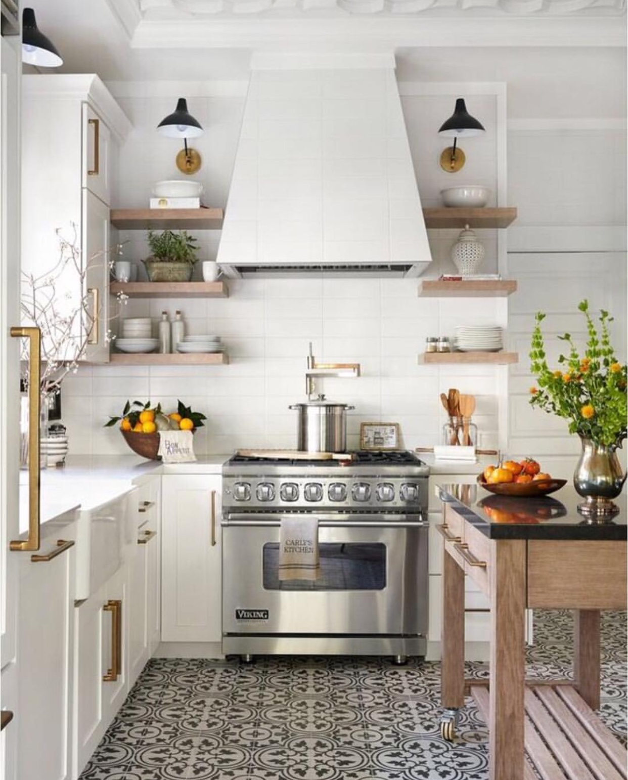
(Photo: Permission granted from Rebecca Reynolds to use on BarbaraFicarra.com. Designers: Rebecca Reynolds and Lori Gilder. Kitchen Design Network Images: Michelle Drew Photography. Show House in Napa, California for Traditional Home Magazine.)
LIVING SPACE DESIGNED WITH YELLOW
I love this living space by interior designer Christopher Burns (@ChristopherCBurns). It’s a serene space with a subtle splash of yellow. The yellow hue in the pillows are soft and inviting.
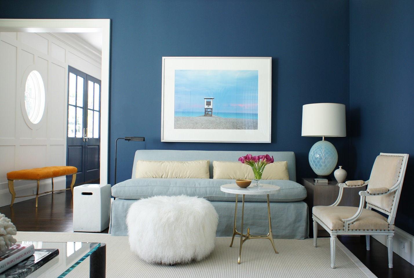
(Photo: Permission granted from Christopher Burns to use on BarbaraFicarra.com.)
LIVEN UP YOUR OFFICE SPACE
If you’re looking to add sunshine and warmth to your office. Take a look at Oh Joy! @ohjoyco — I love the subtle pops of yellow in the artwork.
4.
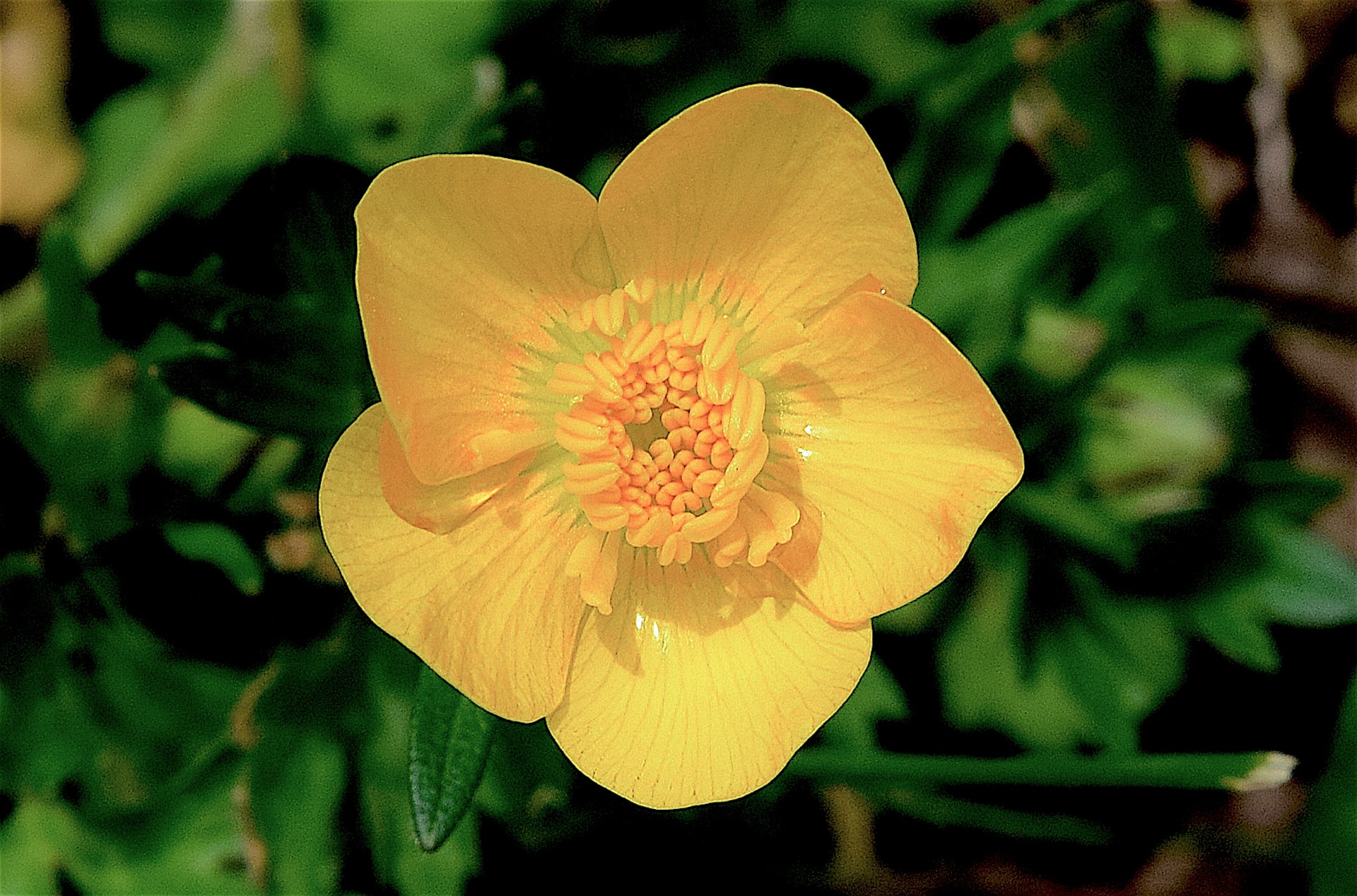
YELLOW IS FOUND IN NATURE AND FOOD
Looking for color inspiration? Look at nature and at the foods you eat because you can become inspired. Here are some inspiring photos of nature and food to get you started to choose the color yellow that you love.
QUICK TIP: When you choose a color, test it in at different times during the day and night. The lighting can significantly change the look of a color.


5.
ACHIEVE HARMONY AND BALANCE
Adding the color yellow is a simple way to achieve harmony and balance. Step out of your comfort zone. If your living space is neutral and you want to add a little color, yellow is a great color to start with. The simplest way is to add fresh yellow flowers to your home. From sunflowers to roses to zinnias and ranunculus–flowers bring color and joy to your home. Spread a little joy around your home. These ranunculus flowers from @farmgirlflowers are so pretty. Look at the beautiful shades of yellow.
Take small steps. Design your own healthy home oasis. Bring a little sunshine into your home. Give yellow a try. It’ll make you smile.
“Keep your face to the sun and you will never see the shadows.”― Helen Keller
Your turn
How do you design a happy and healthy home? Do you have the color yellow in your home? I would love to hear your thoughts in the conversation section below. As always, thank you for your time.
Thanks for being part of the Healthy Design Community at BarbaraFicarra.com. If you have any questions, please feel free to contact me here, and you can receive free healthy design newsletters here.
Healthy Design Element: Harmony and Balance | Color
Healthy Design Action:
Add color to your home. Yellow is a good color to start with. Go big and bold or small and subtle. It’s the simple things in life that can bring great joy.
Design Your Healthy Life™
Read more about Barbara and Chris here.
And, you’ll find more information on color here. Leatrice “Lee” Eiseman is the Director of the Eiseman Center for Color Information & Training and Executive Director of the Pantone® Color Institute.
#DYHL #healthyhome #healthydesign
Everyday Well Design…Healthy Design for Life and Home.
Read more here:
2 Comments
Leave a reply →